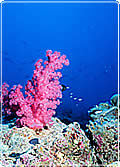
How fast does a tropical coral like this grow? Warm water reefs grow at up to 150 mm a year, however scientists are arguing that increasing levels of carbon dioxide in the oceans is slowing the rate of coral growth.
Line graphs can be used to show a trend or a rate of change like this but you need to interpret them carefully. What’s the difference between the two graphs on the right? Which is more helpful? To whom?
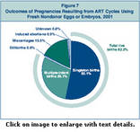 Pie charts are used to show proportions or percentages represented as slices of a pie. The bigger the slice of pie the more that slice represents. Here a pie chart is used by the US National Center for Chronic Disease Prevention and Health Promotion to represent the national figures for the success of assisted reproductive technologies in 2001.
|
But pie charts aren’t very good when displaying small chances or risks. In the fictitious example left, the risk of a serious complication is double that of an allergic reaction but it is hard to pick out.
|
The same thing happens with a bar chart. Bar charts are used for comparing the total number of events or occurrences in different categories. | |
One way around this is to use a ‘wall of balls’. People find them much easier to interpret.
 Probability and chance


What's your opinion?
Average rating


Not yet rated